
There’s one almost effortless step you can take to make your written words compelling, easy to read and pleasing to the eye: choosing appropriate fonts. Many content managers have neglected this task, and indeed it probably doesn’t register consciously in your visitors’ minds. Nevertheless, presenting your pages in the right fonts can made a difference in perceptions of your site. Data published in the Journal of Advertising and Promotion Research found that fonts played a significant role in the way participants responded to advertising.
Categories of Fonts
There are five generic families of fonts as defined in the CSS web specifications. They each have their own particular traits and are suited to different purposes.
Serif
Fonts belonging to this category contain serifs: little tails, hooks or lines at the edges of letters. Frequently used serif fonts include Times New Roman, Georgia and Baskerville Old Face.
It’s the received wisdom in the publishing industry that serif fonts are the easiest style to read in printed form although scientific studies on the matter have been inconclusive. They are common in books, magazines and other long-form, physically tangible material.
Sans-Serif
Hard-to-see decorative flourishes have no place in the sans-serif family, which makes these fonts look more simple, sleek and modern than their serif-laden brethren. Arial, Tahoma and Helvetica are popular examples.
It used to be the case that readers preferred sans-serif fonts on their computers because they rendered better on low-res screens. In 2012, Nielsen Norman Group found this to no longer be true. Unless they possess old displays, users don’t find sans-serif necessarily more readable than serif fonts.
Monospace
Monospace fonts are designed so that each character occupies the same amount of horizontal space. This was important in the days of typewriters and early computers because these machines weren’t sophisticated enough to deal with the justification of text and variable spacing between letters. Courier New, Lucida Console and Monaco are all monospace fonts.
Websites related to programming often list code in monospace typefaces because it’s important to tell exactly what each character is and its precise position in relation to the rest of the program.
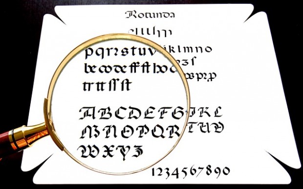
Cursive and Fantasy
Fonts belonging to the cursive and fantasy categories aren’t meant for lengthy blocks of text because they’re too hard to read. You can, however, employ them to good effect for titles, logos and other areas where they’re intended to make a visual impact rather than being scannable.
Choosing the Right Fonts
You’ll probably only want to use a limited array of fonts within your website. Any more than about five, and you’ll risk distracting your guests while presenting them with conflicting messages. You can choose one for your main content, another for headlines and subtitles, and perhaps a third for miscellaneous material.
Select fonts that present the tone and image you want to portray. This is more an art than a science, but a study from Wichita State University may provide some guidance in this area.

You can find plenty of free fonts to embed within your website from Google Fonts and Font Squirrel. Be aware that anyone who doesn’t have your fonts installed will have to wait for them to download, reducing your page speed. It might therefore be better to stick with commonly found fonts for faster loading times. CSS Font Stack has a listing of web safe fonts that are already installed to a large fraction of users’ computers.
Make your content seem better – without anyone being able to put their finger on exactly why – by carefully picking your fonts. This is a really low-cost solution that shouldn’t occupy too much of your time or require you to buy anything. You’ll accomplish the twin objectives of increasing user engagement and tailoring your site’s appearance according to the composition of your intended audience, both worthwhile goals.