The colors you use to display your web content can have a big impact on user engagement and conversions. Not only do the colors of your text matter, but so do those you use for your logo, nav elements, CTAs and other peripheral aspects of your web pages. Indeed, research shows that people form an opinion of a product within 90 seconds of first seeing it, and the majority of this is based upon its coloring.
Enhance Your Brand
Certain colors conjure up specific mental states in viewers. You’ll want to chose wisely so that your site is consistent with the image you wish to portray. While there is some variation in the way hues are perceived in differing cultural contexts and by certain demographic groups, the following associations usually hold true:
- Red – excitement, love, heat, danger
- Orange – food, confidence, warmth
- Yellow – youth, happiness, sunshine
- Green – wealth, growth, environmentalism
- Blue – trust, conservatism, serenity
- Black – edginess, elegance, death
- Brown – food, ruggedness, outdoors
- Purple – luxury, prestige, spirituality
- White – purity, simplicity, goodness
Besides these general impressions given off by each color, there are combinations that convey a specific message. For instance, red and green promote topics related to Christmas while the colors of a flag highlight the country or organization represented by it.
Choosing Tones That Work Together
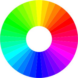
Once you’ve decided upon one or a couple of colors that you like, you’ll want to find other hues that mesh well with them. One school of thought holds that tones that are adjacent to each other on the color wheel look good together. Others advocate triadic schemes, which means using colors that are 120 degrees apart on the color wheel.
A study published in Attention, Perception, & Psychophysics attempted to get to the bottom of people’s preferences in this area. The researchers found that the most successful schemes employed adjacent colors accentuated by occasional use of triadic colors as highlights.
If you’re having some trouble deciding among the millions of possibilities, you can try out the free Adobe Color CC web app or peruse the user-generated palettes created by the Colourlovers.com community.
High-Contrast Text is Key
Regardless of the coloration you eventually decide upon, remember to set up a high contrast between your text and background. A failure to do so means that your words will be hard to read, and you’ll therefore have problems enticing visitors to browse to your website. Black on white is traditional in written material for a reason, and dark gray on a light pastel color isn’t bad either.
Calls to Action
Your CTAs ought to jump out to your users. Rather than a bland or laid-back color, like brown, gray or navy blue, you’ll want to grab the eyes by using red, yellow, bright green or another vibrant hue. In a famous A/B test, HubSpot found that conversions increased by 21% after changing a CTA button from a color that fit in with the rest of the page to a bright shade that stood out.
http://www.publicdomainpictures.net/view-image.php?image=126848&picture=radiant-color-background
Present a Winning Appearance
Modern high-res displays can show millions of different colors accurately. This doesn’t imply that you should feature a large number of them on your website. By carefully selecting a few hues that represent your brand and look appealing in combination with each other, you can delight your website visitors and keep them coming back for more.


